The Bold-But-Clean Poster:
How to Command Attention in Three Seconds
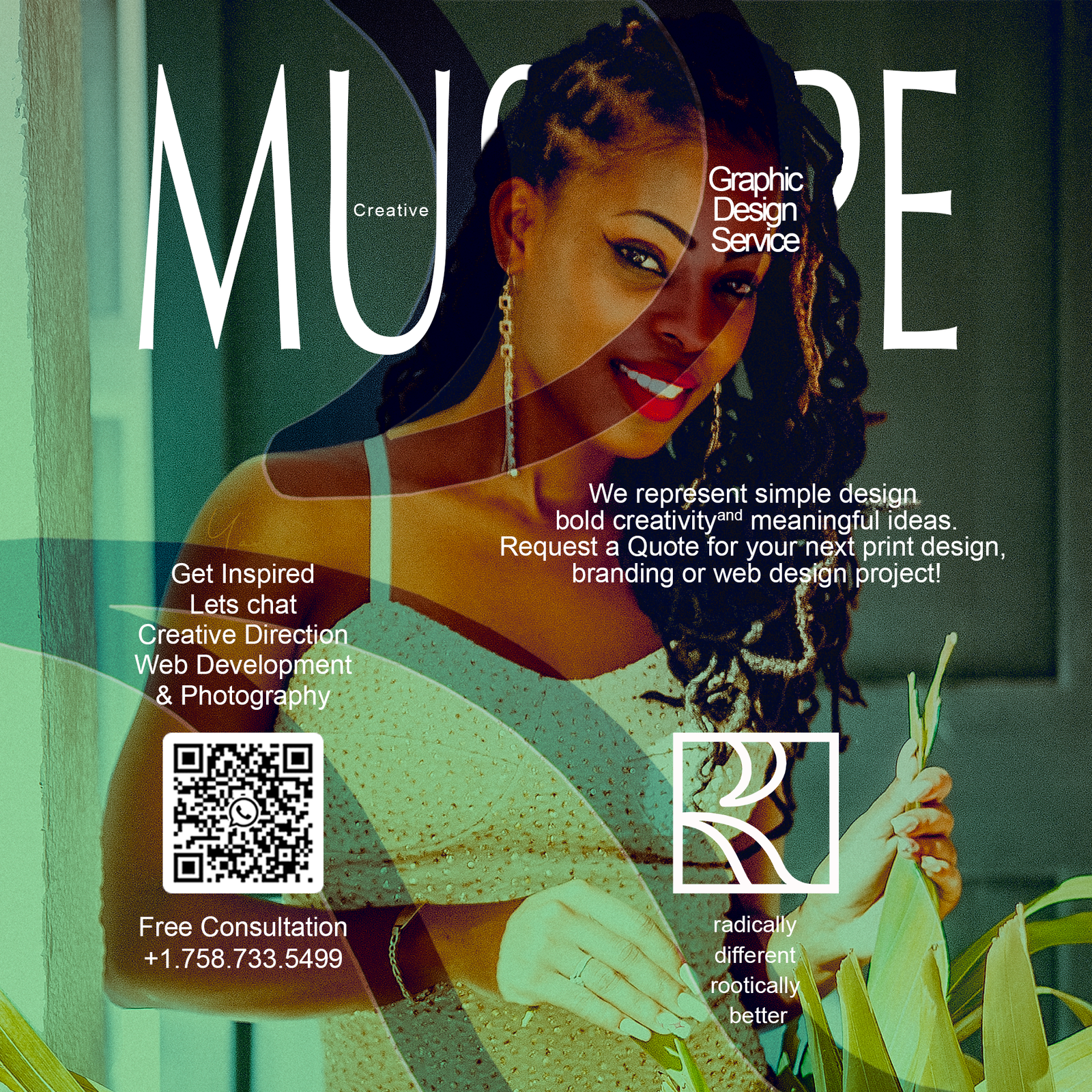
Posters must win in three seconds: a hook, a read, a reason to care. Bold typography anchors the message, supported by clean composition and a single unmistakable focal point.
We design hierarchy first—what must be read at 10 meters, 3 meters, and arm’s length. Imagery supports, not competes, with the headline. Color is chosen for contrast and meaning, not decoration.
Phasellus lobortis blandit ipsum, at adipiscing eros porta quis.
Printing constraints guide the craft. We consider stock, finishes, bleed, and ink behavior early so designs stay honest from Figma to press. Sustainable materials are prioritized without sacrificing durability.
Nulla facilisi. Vestibulum
pretium, dui eu aliquam faucibus, est dui hendrerit nulla, mattis semper
turpis mauris eget tellus. Nulla accumsan rutrum nibh, sed eleifend
felis blandit.
- Consectetur adipiscing elit vtae elit libero
- Nullam id dolor id eget lacinia odio posuere erat a ante
- Integer posuere erat dapibus posuere velit
The goal is always action: a scan, a save, a share, a ticket purchase. When the design respects human attention, the audience returns the favor.
Comments are closed.